Styling rows, cells, and headers
TableView provides several ways to customize the appearance of rows, cells, and column headers. You can apply global styles, per-column styles, grid line settings, and alternate row colors.
When to use it
Use styling to match your application's design language, improve readability with alternating row colors, or add visual structure with grid lines.
Cell style
Apply a style to all cells in the table:
<tv:TableView ItemsSource="{x:Bind Products}">
    <tv:TableView.CellStyle>
        <Style TargetType="tv:TableViewCell">
            <Setter Property="Padding" Value="8,4" />
            <Setter Property="FontSize" Value="13" />
        </Style>
    </tv:TableView.CellStyle>
</tv:TableView>
Apply a style to all cells in a specific column:
<tv:TableViewTextColumn Header="Name" Binding="{Binding Name}">
    <tv:TableViewTextColumn.CellStyle>
        <Style TargetType="tv:TableViewCell">
            <Setter Property="Background" Value="#F0F4FF" />
        </Style>
    </tv:TableViewTextColumn.CellStyle>
</tv:TableViewTextColumn>
Column header style
Apply a style to all column headers:
<tv:TableView ItemsSource="{x:Bind Products}">
    <tv:TableView.ColumnHeaderStyle>
        <Style TargetType="tv:TableViewColumnHeader">
            <Setter Property="Background" Value="{ThemeResource AccentFillColorDefaultBrush}" />
            <Setter Property="Foreground" Value="White" />
            <Setter Property="FontWeight" Value="SemiBold" />
        </Style>
    </tv:TableView.ColumnHeaderStyle>
</tv:TableView>
Apply a style to a specific column's header:
<tv:TableViewTextColumn Header="Price" Binding="{Binding Price}">
    <tv:TableViewTextColumn.HeaderStyle>
        <Style TargetType="tv:TableViewColumnHeader">
            <Setter Property="HorizontalContentAlignment" Value="Right" />
        </Style>
    </tv:TableViewTextColumn.HeaderStyle>
</tv:TableViewTextColumn>
Element style and editing element style
For bound column types, use ElementStyle to style the display element and EditingElementStyle to style the editing element:
<tv:TableViewTextColumn Header="Notes" Binding="{Binding Notes}">
    <tv:TableViewTextColumn.ElementStyle>
        <Style TargetType="TextBlock">
            <Setter Property="Foreground" Value="{ThemeResource TextFillColorSecondaryBrush}" />
            <Setter Property="FontStyle" Value="Italic" />
        </Style>
    </tv:TableViewTextColumn.ElementStyle>
    <tv:TableViewTextColumn.EditingElementStyle>
        <Style TargetType="TextBox">
            <Setter Property="MaxLength" Value="200" />
        </Style>
    </tv:TableViewTextColumn.EditingElementStyle>
</tv:TableViewTextColumn>
Alternating row colors
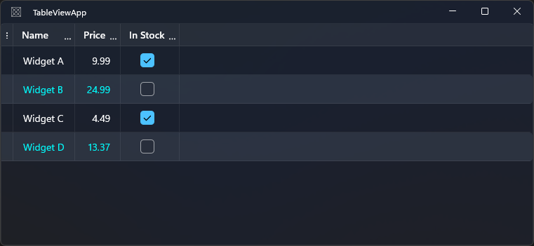
Set background and/or foreground for even-indexed rows:
<tv:TableView AlternateRowBackground="#50515C6B"
              AlternateRowForeground="#FF00FFFF" />
The alternate style is applied to even rows (0-based index: rows 0, 2, 4, …).
Grid lines
Control the visibility and appearance of grid lines:
<tv:TableView GridLinesVisibility="All"
              HorizontalGridLinesStrokeThickness="1"
              VerticalGridLinesStrokeThickness="1"
              HorizontalGridLinesStroke="#E0E0E0"
              VerticalGridLinesStroke="#E0E0E0" />
| Property | Type | Default | Description |
|---|---|---|---|
GridLinesVisibility |
TableViewGridLinesVisibility |
All |
Which grid lines to show for data rows |
HeaderGridLinesVisibility |
TableViewGridLinesVisibility |
All |
Which grid lines to show in the header row |
HorizontalGridLinesStrokeThickness |
double |
1 |
Thickness of horizontal lines |
VerticalGridLinesStrokeThickness |
double |
1 |
Thickness of vertical lines |
HorizontalGridLinesStroke |
Brush |
theme default | Color of horizontal lines |
VerticalGridLinesStroke |
Brush |
theme default | Color of vertical lines |
TableViewGridLinesVisibility values:
| Value | Description |
|---|---|
All |
Both horizontal and vertical grid lines |
Horizontal |
Only horizontal lines |
Vertical |
Only vertical lines |
None |
No grid lines |
Hide all grid lines
<tv:TableView GridLinesVisibility="None"
              HeaderGridLinesVisibility="None" />
Summary of styling properties
| Property | Target | Level |
|---|---|---|
CellStyle |
TableViewCell |
Table or column |
ColumnHeaderStyle |
TableViewColumnHeader |
Table |
TableViewColumn.HeaderStyle |
TableViewColumnHeader |
Column |
TableViewColumn.CellStyle |
TableViewCell |
Column |
TableViewBoundColumn.ElementStyle |
Display element (e.g. TextBlock) |
Column |
TableViewBoundColumn.EditingElementStyle |
Editing element (e.g. TextBox) |
Column |
AlternateRowBackground |
Row background | Table |
AlternateRowForeground |
Row foreground | Table |
GridLinesVisibility |
Grid lines | Table |
HeaderGridLinesVisibility |
Header grid lines | Table |