Row details
Row details provide an expandable panel below each data row that can display additional information about that row's item. The panel is defined with a DataTemplate and can be shown automatically or on demand.
When to use it
Use row details when each row's data has more information than fits in the columns — for example, an order list where clicking a row reveals the order line items, or a customer list where the detail panel shows contact info and notes.
Basic example
Provide a RowDetailsTemplate and choose a visibility mode:
<tv:TableView ItemsSource="{x:Bind Orders}"
              RowDetailsVisibilityMode="VisibleWhenSelected">
    <tv:TableView.RowDetailsTemplate>
        <DataTemplate>
            <StackPanel Padding="16" Spacing="8">
                <TextBlock Text="{Binding Name}" FontSize="18" FontWeight="SemiBold" />
                <TextBlock>
                    <Run Text="Price: " FontWeight="SemiBold" />
                    <Run Text="{Binding Price}" />
                </TextBlock>
                <Border HorizontalAlignment="Left" Padding="8,4" CornerRadius="12" Background="{ThemeResource SystemFillColorSuccessBackgroundBrush}">
                    <TextBlock FontWeight="SemiBold">
                        <Run Text="In stock: " />
                        <Run Text="{Binding InStock}" />
                    </TextBlock>
                </Border>
            </StackPanel>
        </DataTemplate>
    </tv:TableView.RowDetailsTemplate>
</tv:TableView>
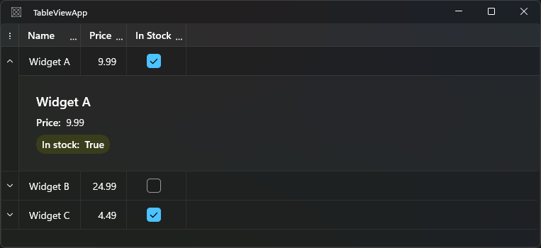
RowDetailsVisibilityMode
| Value | Description |
|---|---|
Collapsed |
Details pane is never shown |
Visible |
Details pane is always shown for every row |
VisibleWhenSelected |
Details pane is shown for the currently selected row(s) |
VisibleWhenExpanded (default) |
Details pane is shown when the user expands a row using the toggle button in the row header |
<!-- Always visible -->
<tv:TableView RowDetailsVisibilityMode="Visible" />

<!-- Show for selected row -->
<tv:TableView RowDetailsVisibilityMode="VisibleWhenSelected" />
Using RowDetailsTemplateSelector
Choose a different template for different row types:
public class OrderDetailsSelector : DataTemplateSelector
{
    public DataTemplate? StandardTemplate { get; set; }
    public DataTemplate? PriorityTemplate { get; set; }

    protected override DataTemplate? SelectTemplateCore(object item) =>
        item is Order { IsPriority: true } ? PriorityTemplate : StandardTemplate;
}
<tv:TableView ItemsSource="{x:Bind Orders}"
              RowDetailsVisibilityMode="VisibleWhenSelected">
    <tv:TableView.RowDetailsTemplateSelector>
        <local:OrderDetailsSelector
            StandardTemplate="{StaticResource StandardOrderDetailsTemplate}"
            PriorityTemplate="{StaticResource PriorityOrderDetailsTemplate}" />
    </tv:TableView.RowDetailsTemplateSelector>
</tv:TableView>
Frozen row details
By default the row details panel scrolls horizontally with the row content. Set AreRowDetailsFrozen to true to keep the details panel anchored at the left edge so it does not scroll:
<tv:TableView AreRowDetailsFrozen="True"
              RowDetailsVisibilityMode="VisibleWhenSelected">
    <tv:TableView.RowDetailsTemplate>
        <DataTemplate>
            <Border Padding="16">
                <TextBlock Text="{Binding Description}" TextWrapping="Wrap" />
            </Border>
        </DataTemplate>
    </tv:TableView.RowDetailsTemplate>
</tv:TableView>
Common options
| Property | Type | Default | Description |
|---|---|---|---|
RowDetailsTemplate |
DataTemplate |
null |
Template for the details panel |
RowDetailsTemplateSelector |
DataTemplateSelector |
null |
Selector for per-row templates |
RowDetailsVisibilityMode |
TableViewRowDetailsVisibilityMode |
VisibleWhenExpanded |
When the details pane is shown |
AreRowDetailsFrozen |
bool |
false |
Prevents the details panel from scrolling horizontally |
Notes and limitations
- When
RowDetailsVisibilityModeisVisibleWhenExpanded, the row header shows an expand/collapse toggle button. Make sureHeadersVisibilityincludesRows(orAll) so the toggle is visible. - Row details panels increase the height of each row. In
Visiblemode, every row will be taller even if the details content is empty. - The
DataContextof the details template is the row's data item, the same as for cells.