Row headers
Row headers appear as a narrow strip on the left side of each row. They can show row numbers, selection indicators, expand/collapse toggles for row details, or any custom content.
When to use it
Use row headers when you need a persistent left-side control for each row that is separate from the data columns — such as a row number, a selection checkbox, or a status icon.
Showing and hiding headers
Use HeadersVisibility to control which headers are visible:
| Value | Description |
|---|---|
All (default) |
Both row headers and column headers are visible |
Columns |
Only column headers are visible |
Rows |
Only row headers are visible |
None |
No headers are visible |
<!-- Show only column headers, no row headers -->
<tv:TableView HeadersVisibility="Columns" />
Custom row header content
Provide a DataTemplate via RowHeaderTemplate to display custom content in each row header:
<tv:TableView ItemsSource="{x:Bind Products}">
<tv:TableView.RowHeaderTemplate>
<DataTemplate>
<Border MinWidth="40">
<FontIcon Glyph="" />
</Border>
</DataTemplate>
</tv:TableView.RowHeaderTemplate>
</tv:TableView>
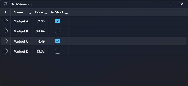
Note: The
Tagof theTableViewRowHeaderis set to the row's 1-based index. Bind to it with{Binding Tag, RelativeSource={RelativeSource Mode=TemplatedParent}}for row numbers.
Selecting a template per row
Use RowHeaderTemplateSelector to choose different templates for different rows:
public class StatusHeaderSelector : DataTemplateSelector
{
    public DataTemplate? ActiveTemplate { get; set; }
    public DataTemplate? InactiveTemplate { get; set; }

    protected override DataTemplate? SelectTemplateCore(object item)
    {
        if (item is Product p)
            return p.IsActive ? ActiveTemplate : InactiveTemplate;
        return base.SelectTemplateCore(item);
    }
}
<tv:TableView ItemsSource="{x:Bind Products}">
    <tv:TableView.RowHeaderTemplateSelector>
        <local:StatusHeaderSelector
            ActiveTemplate="{StaticResource ActiveRowHeaderTemplate}"
            InactiveTemplate="{StaticResource InactiveRowHeaderTemplate}" />
    </tv:TableView.RowHeaderTemplateSelector>
</tv:TableView>
Sizing the row header
| Property | Default | Description |
|---|---|---|
RowHeaderWidth |
NaN (auto) |
Fixed width for the row header column |
RowHeaderMinWidth |
16 |
Minimum row header width |
RowHeaderMaxWidth |
∞ |
Maximum row header width |
RowHeaderActualWidth |
read-only | The rendered width of the row header column |
<tv:TableView RowHeaderWidth="40" />
Row details expand/collapse
When RowDetailsVisibilityMode is set to VisibleWhenExpanded, the row header shows an expand/collapse toggle button automatically. See Row details for the full row details feature.
Notes and limitations
- Row headers are always frozen — they do not scroll horizontally.
- The row header width is shared across all rows; you cannot set a different width per row.